
Some brands feel recognizable within seconds, even before you notice the logo. You see a certain color combination, a style of photography, or the way text is arranged on a page, and you already know who it belongs to. That reaction is not accidental. It comes from a carefully built visual identity that works together as a complete system instead of relying on one design element.
A lot of businesses spend months perfecting a logo, but ignore everything around it. Then the brand starts feeling inconsistent across social media, packaging, websites, and ads. The truth is, people rarely remember a logo alone. They remember how the brand made them feel visually. That emotional familiarity is what creates strong brand recognition and long-term trust.
Why Visual Appeal Shapes Brand Perception So Quickly

People make visual judgments fast. Before reading a headline or understanding a product, they react to the design, spacing, imagery, and overall presentation. If the visual experience feels clean and intentional, the brand instantly appears more trustworthy.
Many premium brands understand this deeply. Their visual identity stays consistent everywhere. The fonts match. The imagery style feels familiar. The layouts follow a predictable rhythm. Even the empty space feels intentional.
That consistency is usually what people are trying to achieve when searching for how to make branding look expensive. It is rarely about adding luxury design trends. It is about creating a cohesive visual language that feels controlled, recognizable, and emotionally aligned.
The Visual Elements That Actually Build Brand Appeal

Strategic Color Choices Create Emotional Signals
Strong brands often follow structured color proportions. One dominant color carries most of the visual weight, a secondary color supports it, and a smaller accent color adds emphasis. This keeps designs balanced instead of visually overwhelming.
Color psychology plays a bigger role in branding than most people realize. Certain colors trigger immediate emotional reactions. Deep blue tones often communicate reliability and trust. Black can feel premium or authoritative. Bright reds create urgency and energy.
Think about how instantly recognizable certain streaming platforms, coffee chains, or athletic brands feel just from their signature colors alone. That recognition comes from repetition and consistency over time.
Typography Gives the Brand Its Personality
Typography acts like a visual voice. A clean sans-serif font can make a company feel modern and tech-focused, while elegant serif fonts often communicate tradition and sophistication.
Strong brand aesthetics usually rely on:
- Defined font pairings
- Consistent spacing and sizing
- Clear heading structures
- Controlled text alignment
- Predictable visual hierarchy
Some of the most recognizable companies even create custom typefaces because typography becomes part of their identity system itself.
Imagery Style Matters More Than Most Logos
A brand’s photography style often leaves a stronger impression than the logo attached to it.
When imagery feels authentic, consistent, and emotionally aligned, people trust the brand more naturally. Clean lighting, recurring editing styles, similar framing choices, and consistent color grading create familiarity across every platform.
Why Layout and White Space Influence Trust

One thing people often overlook in visual branding is structure. Layout systems silently control how professional a brand feels.
Brands with strong design consistency usually rely on grids and spacing systems that keep every page visually organized. Content feels easier to scan because the structure guides the eye naturally.
White space is especially important here. Many businesses try to fill every empty corner with text, graphics, or calls to action. The result usually feels chaotic and mentally exhausting.
Intentional spacing creates breathing room. It makes information easier to understand and gives the brand a calmer, more premium presence.
This is common in modern brand design. Minimal layouts often feel more sophisticated because they remove unnecessary visual noise.
Common Branding Mistakes That Hurt Visual Appeal
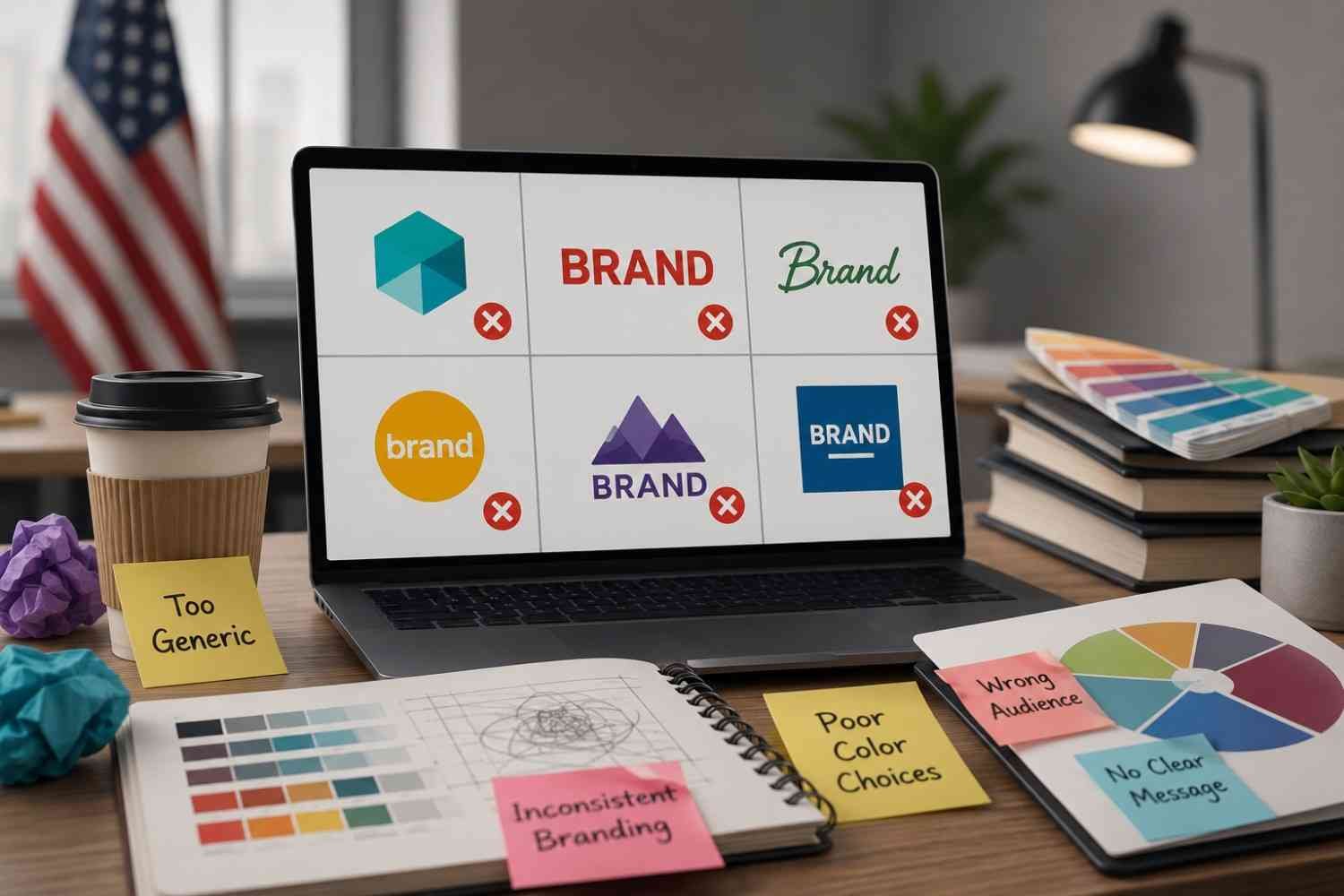
Inconsistent Design Across Platforms
One of the biggest problems is inconsistency between social media, websites, ads, and packaging. When every platform feels visually disconnected, trust weakens quickly.
Following Trends Too Aggressively
Trend-heavy branding often ages fast. Brands that rely only on temporary design aesthetics usually lose identity over time.
Overcrowded Visuals
Too many fonts, colors, graphics, or animations create visual fatigue. Simplicity usually creates stronger recognition.
Generic Stock Imagery
Overused stock visuals remove authenticity. Audiences recognize generic branding immediately, even subconsciously.
FAQs: What Makes a Brand Visually Appealing Beyond Just a Logo
1. Why do some brands feel premium without expensive visuals?
Premium branding usually comes from consistency, spacing, typography, and emotional clarity rather than expensive graphics. Simple design systems often feel more refined than overly complex visuals.
2. Can a brand be recognizable without a strong logo?
Yes. Many brands become recognizable through color palettes, photography style, typography, and layout consistency rather than relying only on logos.
3. How important is typography in branding?
Typography is one of the strongest parts of visual identity. Fonts influence readability, personality, trust, and emotional perception across every platform.
4. What creates strong brand consistency?
Consistent colors, imagery, typography, spacing, tone, and design systems create a cohesive branding experience that audiences recognize quickly.
Closing Perspective
The brands people remember are rarely built around logos alone. They create complete visual ecosystems where every design choice feels connected. Colors, typography, imagery, spacing, motion, and physical presentation all work together to shape perception long before someone reads a sentence or buys a product.
That is why visually appealing brands feel effortless from the outside. Behind that simplicity is usually a highly controlled system built on consistency, emotional clarity, and intentional design decisions that repeat across every customer touchpoint.


