


Typography is one of the most overlooked parts of branding, yet it quietly controls how your brand feels. The fonts you choose, the way your text is spaced, and how your headlines are styled all work together to create a visual voice. That’s why understanding typography for brand identity is essential if you want your brand to look consistent, professional, and memorable.
When I look at a brand, I don’t just notice the logo or colors. I notice how the text feels. Is it clean and modern? Bold and energetic? Elegant and refined? Friendly and casual? Typography answers all of these questions without saying a word.
What Is Typography in Brand Identity?
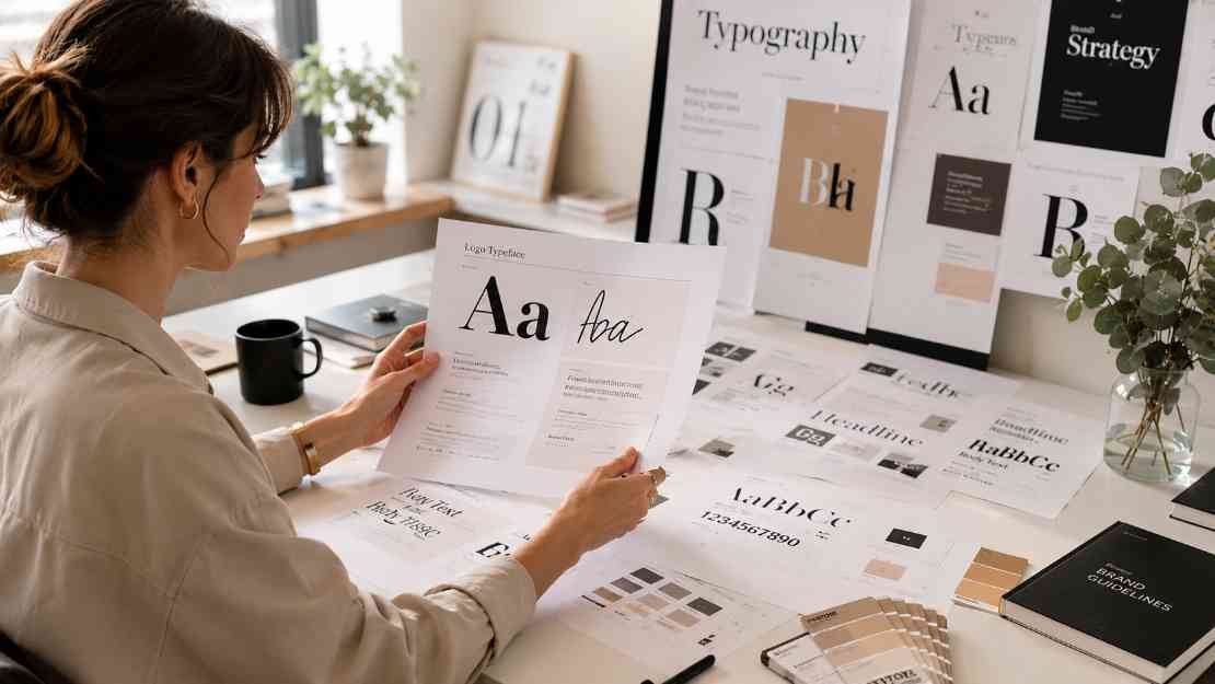
Typography in branding is the system of fonts, sizes, spacing, and styles used across all your visual content. It includes your logo font, headline font, body text font, and rules for how they are used.
Typography is not just about choosing a font you like. It is about creating a structured system that works across your website, social media, emails, presentations, packaging, and marketing materials. A strong typography system helps your brand look consistent everywhere it appears.
Why Typography Matters More Than You Think
Typography shapes perception. Before someone reads your message, they already feel something based on how your text looks.
A clean sans-serif font can make your brand feel modern and easy to understand. A serif font can make your brand feel traditional and trustworthy. A script font can feel personal or elegant. A bold display font can feel creative and expressive.
Typography also affects readability. If your text is hard to read, people will not stay long enough to understand your message. Good typography makes content easy to scan, easy to follow, and easy to remember.
Consistency is another key benefit. When your fonts stay the same across all platforms, your brand becomes more recognizable.
The Core Components of Brand Typography
A strong typography system is built from a few key elements. Once these are defined, everything becomes easier.
- Primary font used for logos and headlines
- Secondary font used for body text
- Font weights such as bold, regular, and light
- Spacing rules including letter spacing and line height
- Text hierarchy for headlines, subheadings, and paragraphs
These elements work together to create structure. Without structure, your brand visuals can feel inconsistent and unorganized.
Understanding Font Categories
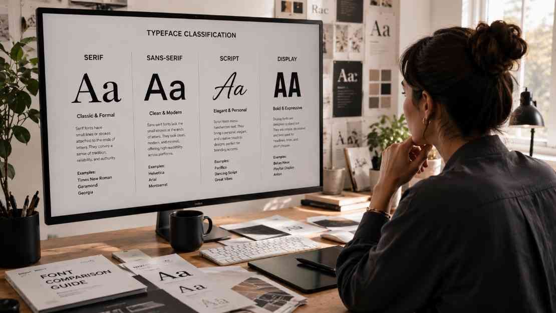
Different font styles communicate different personalities. Choosing the right category is the first step in building your typography system.
Serif fonts have small details at the ends of letters. They often feel classic, reliable, and refined. They are commonly used in luxury, editorial, or traditional brands.
Sans-serif fonts are clean and simple without extra details. They feel modern, minimal, and approachable. They are widely used in tech, startups, and digital brands.
Script fonts mimic handwriting. They can feel elegant, creative, or personal. They are often used in beauty, fashion, or boutique brands, but should be used carefully to maintain readability.
Display fonts are bold and decorative. They are used to grab attention and create a unique identity. They work best for logos or short headlines, not long paragraphs.
“Google offers a large library of free fonts through Google Fonts typography library.
How to Choose the Right Fonts for Your Brand
Choosing fonts becomes easier when you connect them to your brand personality. Start by defining how you want your brand to feel.
If your brand is professional and corporate, choose clean and structured fonts. Your brand is creative, you can explore more expressive options. If your brand is calm and minimal, choose simple and light typography.
Avoid choosing fonts just because they look trendy. Trends change, but your brand needs consistency. Always test your fonts in real situations like website text, social posts, and mobile screens.
Create a Clear Typography Hierarchy
Hierarchy is what guides the reader’s eye. It helps people understand what is most important and what to read first.
Headlines should be larger and more prominent. Subheadings should support the structure. Body text should be easy to read and not too small. Captions and supporting text should be lighter and less dominant.
When hierarchy is clear, your content becomes easier to scan. This is especially important for websites, blogs, and social media where attention spans are short.
You can learn more about readability standards through the Nielsen Norman typography usability guide.
The Role of Spacing in Typography
Spacing is often ignored, but it has a huge impact on how your text looks and feels.
Kerning controls the space between individual letters. Tracking adjusts the spacing across a word or sentence. Leading controls the space between lines of text.
Good spacing improves readability and creates a clean design. Tight spacing can feel cramped and difficult to read. Too much spacing can feel disconnected. The goal is balance.
Keep Your Font Choices Simple
One of the most common mistakes is using too many fonts. This can make your brand look inconsistent and confusing.
Stick to two or three fonts at most. A common setup is one font for headlines and one for body text. You can use different weights within the same font family to create variety without adding new fonts.
This approach keeps your design clean and professional.
Typography Across Different Platforms

Your typography should work everywhere, not just in one place. A font that looks great on a desktop may not work well on a mobile screen.
Test your typography on different devices, screen sizes, and formats. Make sure your body text is readable on phones. Ensure your headlines do not break awkwardly. Check how your fonts look in social media graphics, email templates, and presentations.
“Strong visuals also matter, especially when creating consistent social media content photography for your brand. Consistency across platforms builds trust and recognition.
Typography and Brand Recognition
Some brands are recognized instantly by their typography. This is because their fonts are used consistently over time.
Even if your brand is new, you can build recognition by using your typography system in every piece of content. Over time, people will associate that look with your brand.
Typography becomes part of your identity, just like your logo or colors. A clear typography system also helps when planning visual posts using these content calendar ideas for creators.
Common Typography Mistakes to Avoid
Many brands struggle with typography because they overlook simple rules. Using too many fonts is one of the biggest mistakes. Another is choosing fonts that are hard to read.
Poor spacing can make even a good font look bad. Inconsistent use of fonts across platforms can break your visual identity. Ignoring hierarchy can make your content feel messy and confusing. The solution is to create clear rules and follow them consistently.
Build a Typography Style Guide

A typography style guide helps you maintain consistency as your brand grows. It should include your font choices, sizes, weights, spacing rules, and examples of how to use them. This guide becomes especially useful if you work with a team or outsource design work. It ensures that everyone follows the same visual system.
Even a simple one-page guide can make a big difference. Adobe also explains professional font systems in this Adobe typography branding guide.
Frequently Asked Questions
1.What is typography for brand identity?
Typography for brand identity is the system of fonts, sizes, spacing, and styles used to represent a brand consistently across all platforms.
2.How many fonts should a brand use?
Most brands should use two or three fonts. One for headlines and one for body text is usually enough.
3.Why is typography important in branding?
Typography affects how people perceive your brand, improves readability, and helps create consistency across all visual content.
4.What is the best font for branding?
There is no single best font. The right choice depends on your brand personality, audience, and goals.
5.How do I make my typography consistent?
Create a style guide with clear rules for fonts, sizes, spacing, and usage. Apply these rules across all platforms.
Typography as Your Brand’s Visual Voice
Typography is more than a design choice. It is how your brand speaks visually. It influences how people feel about your content, how easily they understand your message, and how they remember your brand.
When combined with other visual elements like your color palette for branding visuals, typography creates a complete identity. It brings structure, clarity, and personality to everything you create.
If you take the time to define your typography system now, you will save time later and create a brand that feels consistent, professional, and easy to recognize.


