


When I first tried to make my own brand look professional, I thought I needed a full design team, a perfect logo, and weeks of planning. I didn’t. What I really needed was a simple system. If you want to learn how to build brand visuals fast, the goal is not to create a perfect brand overnight.
The goal is to create a clear, consistent visual identity that makes your website, social media, emails, and marketing materials feel connected.
A strong brand visual system usually includes your logo, colors, fonts, image style, layouts, and design rules. Canva describes a brand kit as a place to store brand colors, fonts, logos, and imagery so designs stay consistent across a team or business.
What Are Brand Visuals?
Brand visuals are the design elements people see when they interact with your business. This includes your logo, color palette, fonts, product photos, social media graphics, website banners, icons, patterns, and even the way your images are cropped.
Visual identity is different from brand identity. Your brand identity includes your values, voice, mission, personality, and brand positioning. Your visual identity is the design side of that personality. When both match, your brand feels more trustworthy and memorable.
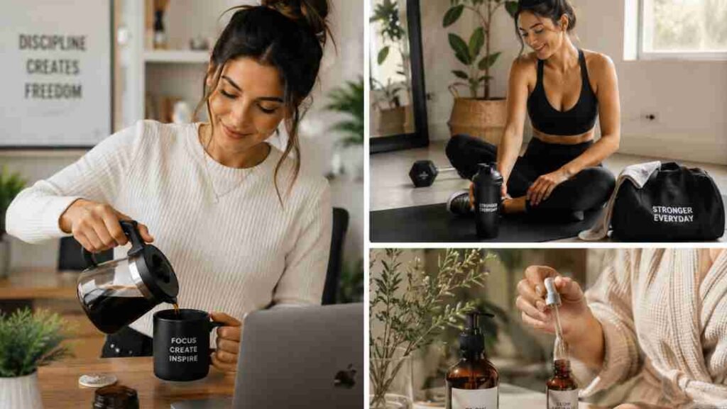
For example, a wellness brand may use soft greens, warm neutrals, clean fonts, and natural lifestyle photos. A tech brand may use sharp layouts, darker backgrounds, modern typography, and high-contrast visuals. The look tells a story before the customer reads a single word.
Why Fast Brand Visuals Still Matter
Speed does not mean sloppiness. When your visuals are consistent, people recognize you faster. A mismatched Instagram profile, website, and email signature can make even a good business feel unfinished.
Visual branding matters because it builds recognition, trust, and confidence. A clean design system helps your audience understand who you are, what you offer, and why they should care. Canva also notes that a visual style guide helps teams save time, create consistent assets, and tell a clear brand story.
Start With a Tiny Brand System
The fastest way to build brand visuals is to stop giving yourself too many choices. I like to start with what I call a tiny system.
Choose one primary color, one secondary color, and one neutral color. Then choose two fonts: one for headings and one for body text. After that, write five words that describe your brand voice and five words you want to avoid.
For example, your brand may be modern, warm, practical, creative, and trustworthy. You may want to avoid looking cold, messy, childish, generic, or overly corporate. These words help you make faster design decisions.
Create a Quick Mood Board

Before designing anything, create a mood board. This does not need to be fancy. Open Pinterest, Canva, or a folder on your desktop and collect screenshots, photos, colors, fonts, packaging, website layouts, and social graphics that feel close to your brand.
Businesses searching for visual inspiration can also explore commercial photography ideas how to create viral commercial photography content to discover creative image concepts that strengthen brand storytelling and audience engagement.
Look for repeated patterns. Are you drawn to bold colors or soft tones? Clean layouts or playful shapes? Real photography or illustrations? This step helps you see your brand direction before you waste time making random graphics.
Pick Your Brand Colors
Color shapes how people feel about your brand. Blue often feels calm and trustworthy. Red feels bold and urgent. Green can feel fresh, natural, or wellness-focused. Black can feel premium and powerful. White feels clean and minimal.
Keep it simple. Pick 2–4 main colors and save the HEX codes. Use the same colors on your website, social media, presentations, product graphics, and emails. This one step can make your brand look more professional almost immediately.
Choose Two Fonts Only
Fonts can make your brand feel playful, elegant, modern, friendly, or serious. But too many fonts can make your visuals look messy.
Choose one heading font and one body font. Your heading font can have more personality, but your body font must be easy to read. Test your fonts on mobile before finalizing them. If people struggle to read your posts, your design is working against you.
Design a Simple Logo
Your logo does not need to be complicated. In fact, simple logos are usually easier to remember and use across different platforms. You can start with a wordmark logo using your brand name in your chosen font. Then create a smaller submark using initials, an icon, or a simple symbol.
Tools like Canva, Looka, and AI logo makers can help you generate quick ideas. Canva’s help center explains that you can create a Brand Kit and add logos, fonts, and colors so your design assets stay organized.
Use AI Tools to Move Faster
AI can help you build faster, but it should not replace your taste. Use it to generate logo ideas, mood board directions, image prompts, social post layouts, and content themes.
Creators building modern visual identities can also explore best photo editing apps to improve branding visuals, social media graphics, and content quality more efficiently.
Canva AI now supports conversational design workflows and can help create on-brand visuals when connected to brand context.
You can also use ChatGPT to brainstorm brand voice words, create image prompts, write design rules, or turn your brand personality into a short style guide. Always check if the result feels like your brand.
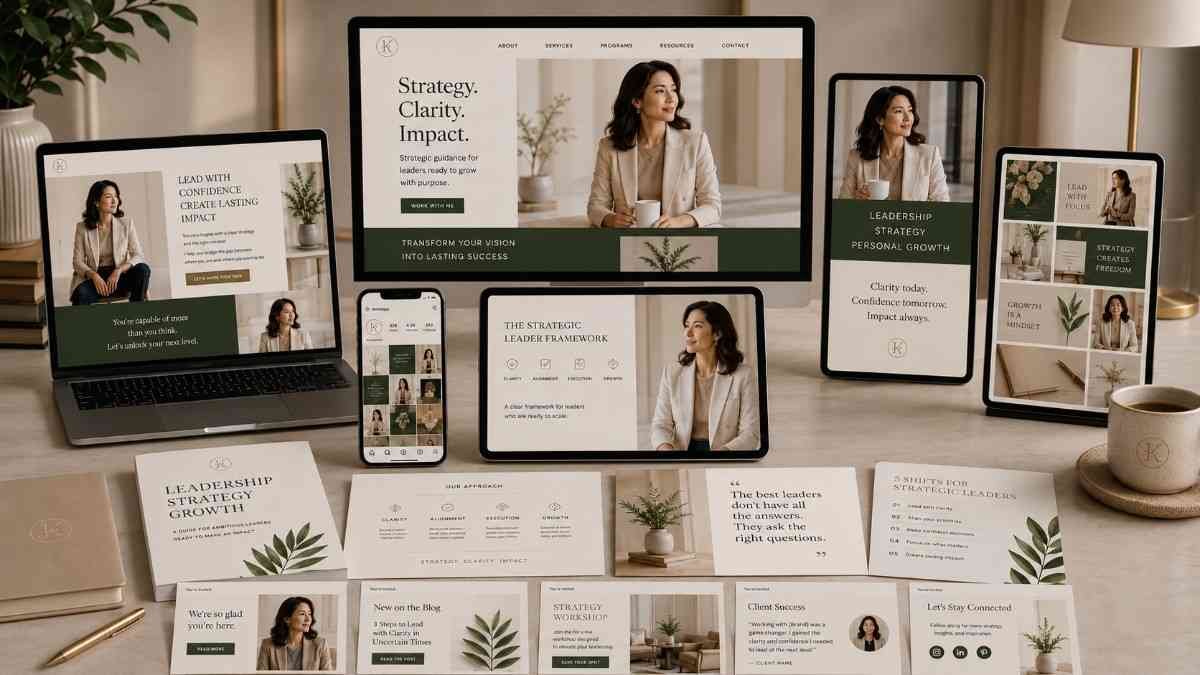
Build a Canva Brand Kit
Once you have your logo, colors, fonts, and image style, save everything in a Canva Brand Kit. This makes it easier to create social posts, flyers, YouTube thumbnails, website graphics, and marketing assets without starting from scratch.
Using Canva brand kit can help organize your logos, fonts, and color palettes so every design stays visually consistent across platforms
Your brand kit should include your primary logo, alternate logo, submark, color codes, font pairings, brand photos, icons, patterns, and sample templates. This keeps your visuals consistent even when you are moving fast.
Create a One-Page Style Guide
A one-page style guide is enough for most small businesses and creators. Include your logo usage, colors, fonts, image style, spacing rules, and brand voice notes.
For example, write simple rules like: use the primary logo on light backgrounds, use warm lifestyle photos, avoid cluttered templates, keep headings bold, and use the neutral color for backgrounds. This document keeps you from reinventing your brand every time you create content.
Make 5–10 Core Templates
Templates are where your brand visuals become useful. Create a few repeatable designs for Instagram posts, stories, Pinterest graphics, blog banners, email headers, product announcements, testimonials, and presentations.
Once these templates are ready, you can produce content much faster. Instead of designing from zero, you only swap the text, image, or offer.
Apply Your Visuals Everywhere
Now deploy your brand visuals across every touchpoint. Update your website header, favicon, social media profile images, email signature, media kit, pitch deck, product mockups, lead magnets, and business cards.
Consistency matters more than complexity. A simple brand used everywhere looks stronger than a beautiful brand used randomly.
Common Brand Visual Mistakes to Avoid
The biggest mistake is using too many colors and fonts. Another common mistake is copying trendy templates that do not match your actual brand personality.
Avoid low-resolution images, stretched logos, poor contrast, cluttered graphics, and inconsistent photo styles. Also avoid changing your colors every week because you saw a new aesthetic online. Fast branding works only when you stay focused.
Quick Checklist for Fast Brand Visuals
Before launching your visuals, check that your logo is clear, your colors match everywhere, your fonts are readable, your images follow one style, your layouts have enough white space, and your style guide is saved in one easy-to-find place. If these basics are done, your brand is ready to show up online.
Frequently Asked Questions
1.What is the fastest way to build brand visuals?
The fastest way is to choose 2–3 colors, two fonts, a simple logo, one image style, and 5–10 reusable templates. Then save everything in a brand kit.
2.Can I build brand visuals without a designer?
Yes. Canva, Looka, AI tools, stock photo platforms, and simple style guides make it possible to create a clean visual identity without hiring a designer.
3.What is the 3 7 27 rule in branding?
The 3 7 27 rule usually refers to repeated brand exposure. People may need to see your brand several times before they remember, trust, or take action. The exact numbers vary by marketer, but the lesson is simple: consistency builds familiarity.
4.What are the 5 C’s of branding?
The 5 C’s of branding are often listed as clarity, consistency, creativity, credibility, and connection. They help your brand feel easy to understand, memorable, and trustworthy.
5.What are the 4 C’s of branding?
The 4 C’s of branding are commonly described as clarity, consistency, credibility, and competitiveness. They help you position your brand clearly in the market.
6.What are the 5 P’s of branding?
The 5 P’s of branding are usually purpose, positioning, personality, promise, and presentation. Together, they shape how your brand sounds, looks, and feels.
7.How often should I update brand visuals?
Update your visuals when your audience changes, your offers evolve, your logo feels outdated, or your brand no longer matches how you want to be seen.
Build a Palette That Becomes Your Visual Signature
A strong color palette for branding visuals is not just decoration. It is a recognition system. It helps people remember your brand, trust your message, and connect with your style before they read a word.
Start small. Pick your main color, supporting colors, accent color, and neutrals. Test them for contrast. Save the HEX codes. Apply them everywhere. Once your colors are clear, it becomes much easier to design websites, posts, logos, and campaigns with confidence.
This is also one of the easiest steps in learning how to build brand visuals fast because the right palette gives every future design a clear direction.


