
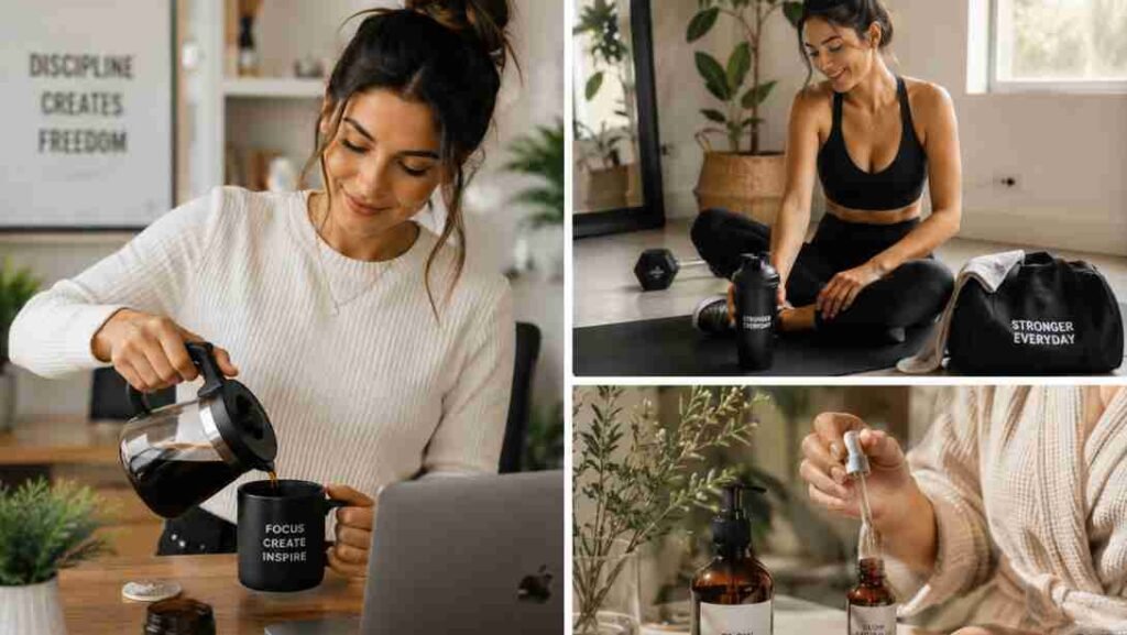

iChoosing the right color palette for branding visuals can feel simple at first, until you realize those colors will show up everywhere: your logo, website, social posts, product packaging, ads, email graphics, and even your business cards.
I like to think of brand colors as the visual mood of a business. Before someone reads your message, your colors already tell them whether your brand feels calm, bold, premium, playful, natural, or trustworthy.
A strong palette does not need dozens of shades. In fact, most professional brands work best with 3–5 core colors. The goal is not to use every beautiful color you find. The goal is to build a small, clear system that makes your brand easy to recognize.
What Is a Brand Color Palette?
A brand color palette is a curated set of colors used consistently across your brand visuals. It usually includes one primary color, one or two secondary colors, one accent color, and one or two neutral colors.
Your primary color is the main shade people should connect with your brand. So your secondary colors support that main shade and add variety. And your accent color is used for buttons, highlights, icons, or calls to action.
Neutrals like white, cream, beige, soft gray, charcoal, or black give your design breathing room.
For example, a wellness brand may use sage green, cream, warm brown, and soft white. A tech brand may use navy, teal, white, and charcoal. A kids’ brand may use yellow, pink, sky blue, and clean white.
Why Brand Colors Matter
Colors influence first impressions. A visitor may decide within seconds whether your brand feels professional, trustworthy, fun, elegant, or confusing. That is why your color choices should support your message, not just your personal taste.
A clear color palette helps you:
- Build brand recognition across platforms
- Make your website and content look more polished
- Create emotional connection with your audience
- Improve readability and user experience
- Stand apart from competitors
When your Instagram posts, website banners, logo, and email graphics all use the same color system, your brand starts to feel familiar. Familiarity builds trust.
Start With Your Brand Personality

Before opening a color generator, define how your brand should feel. This step saves you from picking random colors that look nice but do not match your business.
Ask yourself: Do I want my brand to feel calm, bold, luxurious, friendly, creative, earthy, modern, playful, or professional? A skincare brand and a cybersecurity brand should not look the same because they need to create different emotional responses.
If your brand is luxury-focused, deeper colors like maroon, black, champagne, cream, or navy may work well. But f your brand is eco-friendly, sage green, olive, brown, beige, and soft cream can feel natural. If your brand is energetic and youthful, yellow, coral, pink, orange, or bright blue may fit better.
Use the 60-30-10 Rule

The 60-30-10 rule is one of the easiest ways to keep your brand visuals balanced. It means your primary color should take up about 60% of your design, your secondary color should take up 30%, and your accent color should take up 10%.
This prevents your visuals from feeling messy. Your main color creates consistency, your secondary color adds depth, and your accent color draws attention to important elements like buttons, links, sale tags, or headings.
For example, if your brand palette is navy, teal, and orange, navy may be used for backgrounds and headings, teal for sections and graphics, and orange only for calls to action.
Choose Colors With Meaning
Color psychology is not a strict rule, but it can help guide your choices. Different colors often create different feelings.
Blue often feels trustworthy, calm, and professional. Green can suggest nature, growth, health, and balance. Yellow feels optimistic, cheerful, and energetic.
Red feels urgent, passionate, and bold. Black feels strong, modern, and premium. Pink can feel creative, soft, youthful, or romantic. Purple often feels imaginative, elegant, or luxurious.
The key is to match the meaning of your colors with the promise of your brand. If your brand teaches calm productivity, soft blues and neutrals may work better than loud reds and oranges. If your brand sells bold fitness programs, high-contrast colors may make more sense.
Popular Color Combinations for Branding
Some color combinations work well because they balance emotion, contrast, and personality.
- Yellow and blue is a strong mix for brands that want to feel friendly but reliable. Yellow adds energy, while blue adds stability.
- Maroon and peach creates a softer premium look. It often works well for beauty, lifestyle, coaching, and boutique brands.
- Navy and teal feels modern, smart, and professional. It is a strong option for tech, consulting, finance, and service businesses.
- Black and orange feels bold and high-energy. It can work for fitness, sports, tools, creative agencies, or brands that want attention quickly.
- Sage green and brown feels earthy, grounded, and organic. It fits wellness, food, gardening, sustainability, and natural product brands.
Understand Color Palette Types
If you want your colors to feel more intentional, use basic color theory. You do not need to be a designer to understand the main palette types.
A monochromatic palette uses one base color with lighter and darker shades. It feels clean, calm, and easy to manage. An analogous palette uses colors next to each other on the color wheel, such as green, teal, and blue.
This feels natural and harmonious. A complementary palette uses opposite colors, such as blue and orange, creating strong contrast.
A triadic palette uses three evenly spaced colors and often feels playful and energetic. For most small brands, a monochromatic or analogous palette is easiest to control. Complementary and triadic palettes can look powerful, but they need more restraint.
Do Not Skip Neutrals
Neutrals are the secret to making bold colors look professional. White, cream, beige, gray, charcoal, and black help balance your palette and make your content easier to read.
Without neutrals, your designs can feel loud and tiring. With neutrals, your main colors stand out more clearly. A bright orange brand, for example, may feel overwhelming if everything is orange. But when paired with cream, charcoal, and soft gray, it becomes more polished.
Make Sure Your Colors Are Readable
A beautiful palette is not useful if people cannot read your content. Always test contrast between text and background. Light gray text on a white background may look trendy, but it can be hard to read.
Use dark text on light backgrounds or light text on dark backgrounds. Check your buttons too. If your call-to-action button does not stand out, users may miss it.
Accessibility matters because your brand visuals should work for as many people as possible, across different screens and lighting conditions.
Best Tools to Create a Brand Color Palette
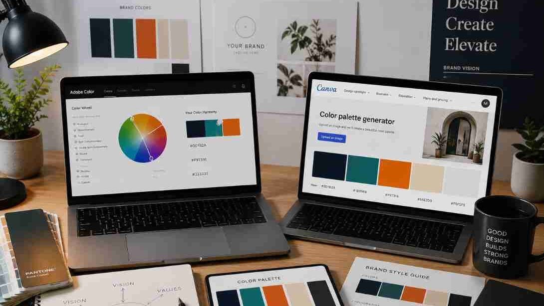
You can build a palette manually, but tools make the process faster and easier.
“Tools like Adobe Color help you build complementary, analogous, and triadic palettes using professional color theory systems
- Colors helps you generate color palettes quickly and lock colors you like.
- Adobe Color lets you create palettes using color theory rules like complementary, analogous, and triadic.
- Canva Color Palette Generator can pull colors from an uploaded image.
Many creators use Canva Color Palette Generator to quickly extract visually balanced colors from mood boards, product photos, and branding visuals.
- Color Hunt offers curated palettes for inspiration.
“You can also explore modern branding combinations and trending visual styles through Color Hunt when planning your brand identity.”
- Figma tools help designers test colors inside real website or app layouts.
My favorite method is to start with a mood image, pull colors from it, then simplify the palette into 3–5 usable shades.
How to Build Your Color Palette Step by Step
Start by choosing one primary color that matches your brand personality. Then choose one secondary color that supports it. Add one accent color for attention. Finally, add one light neutral and one dark neutral.
Once you have these colors, write down the HEX codes and save them in your Canva Brand Kit, website settings, design files, or style guide when learning photo editing. Then test them on real materials like a website banner, Instagram post, blog graphic, and email header. If the colors look good together across different formats, you have a practical palette.
Common Color Palette Mistakes
Many beginners choose too many colors. This makes the brand look scattered. Another mistake is picking colors only because they are trendy. Trends fade, but your brand needs to stay recognizable.
Some brands also forget contrast. A soft beige and pale yellow palette may look pretty, but it may not give enough readability. Others use one color everywhere, which can make designs feel flat. Your palette should feel simple, flexible, readable, and aligned with your brand personality.
Where to Use Your Brand Colors
Once your palette is ready, apply it everywhere. Use it in your logo, website, social media graphics, thumbnails, business cards, presentations, lead magnets, ads, email templates, packaging, and invoices.
The more consistent you are, the easier it becomes for people to remember your brand. This does not mean every design must look identical. It means every design should feel like it belongs to the same family.
Frequently Asked Questions
1.What is a color palette for branding visuals?
A color palette for branding visuals is a selected group of colors used consistently across your logo, website, social media, ads, packaging, and marketing materials.
2.How many colors should a brand palette have?
Most brands work best with 3–5 core colors. This usually includes a primary color, secondary color, accent color, light neutral, and dark neutral.
3.What is the 60-30-10 rule in branding colors?
The 60-30-10 rule means using your main color for 60% of a design, your secondary color for 30%, and your accent color for 10%.
4.Which colors are best for a luxury brand?
Luxury brands often use black, white, gold, champagne, navy, maroon, cream, or deep green. These colors can create a premium and refined feel.
5.What tools can I use to create a brand color palette?
You can use Coolors, Adobe Color, Canva Color Palette Generator, Color Hunt, and Figma to create, test, and organize brand colors.
Build a Palette That Becomes Your Visual Signature
A strong color palette for branding visuals is not just decoration. It is a recognition system. It helps people remember your brand, trust your message, and connect with your style before they read a word.
Start small. Pick your main color, supporting colors, accent color, and neutrals. Test them for contrast. Save the HEX codes. Apply them everywhere. Once your colors are clear, it becomes much easier to design websites, posts, logos, and campaigns with confidence.
This is also one of the easiest steps in learning content creation for brand visuals fast because the right palette gives every future design a clear direction.


