
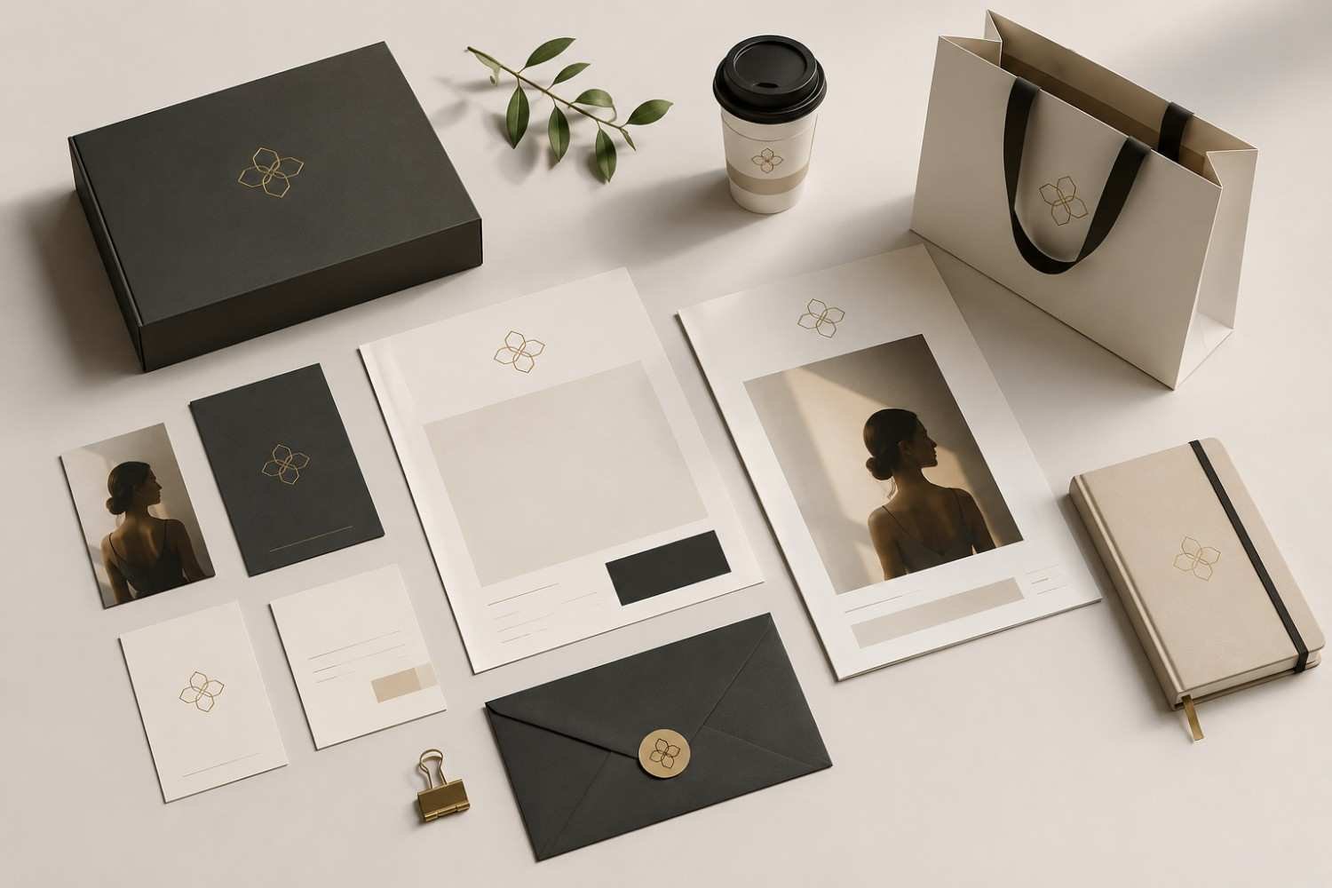
A lot of brands try to look premium by adding more. More colors, more graphics, more effects, more words. But expensive branding rarely works that way. The brands people instantly trust usually feel controlled, intentional, and visually calm. Nothing looks random. Nothing fights for attention. That restraint is often what creates the feeling of quality.
You can usually tell when a brand has been overdesigned. The logo feels crowded, the website looks noisy, and every post uses a different style. On the other hand, premium visual branding tends to feel edited. Even small design choices like typography spacing, muted colors, or cleaner layouts can completely change how people perceive a business. That shift matters because brand perception often shapes whether people trust your product before they even use it.
Expensive Branding Starts With Visual Restraint
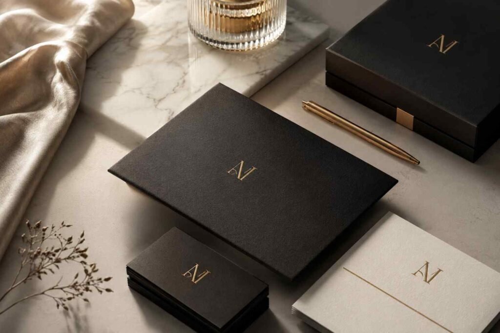
One of the biggest differences between average branding and luxury branding is editing. Premium brands rarely try to show everything at once. They remove distractions instead.
That applies to logos, websites, packaging, and even social media content. A cleaner visual identity design allows people to focus on the message instead of fighting through clutter. In many cases, simplifying a brand actually makes it feel more expensive.
A strong brand-focused editing workflow can help create this effect naturally because it forces every visual element to earn its place. When brands stop adding unnecessary details, their identity becomes easier to recognize and trust.
Minimalist branding does not mean boring branding. It means intentional branding.
Typography Quietly Changes Brand Perception
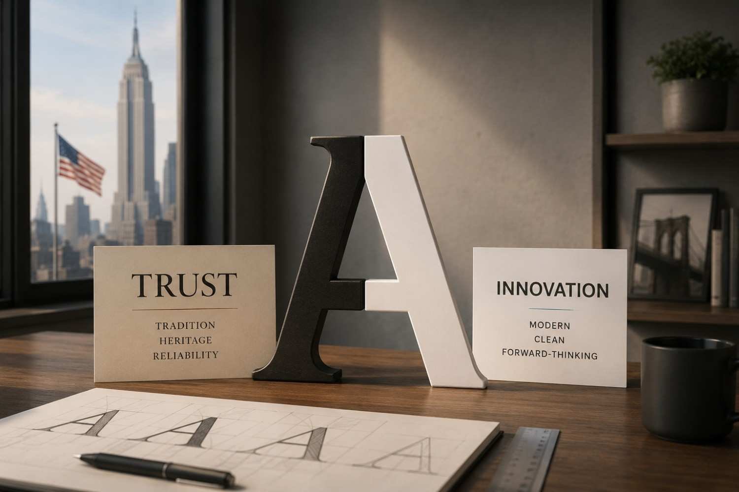
Typography is one of the fastest ways to make a brand look either premium or cheap. Many high-end branding systems rely heavily on typography hierarchy because fonts carry emotional weight.
Serif Fonts Create a Sense of Heritage
Luxury fashion houses, premium hotels, and upscale beauty brands often use high-contrast serif fonts because they communicate tradition and confidence. Sharp terminals and elegant spacing create a refined branding style without needing extra decoration.
Even subtle changes in letter spacing can make a logo feel more polished. Expanding tracking on uppercase typography creates breathing room and gives the design a deliberate rhythm.
Geometric Sans-Serifs Feel Modern and Controlled
Not every premium brand uses serif fonts. Some modern brands lean into geometric sans-serif typefaces because they feel structured and clean. Fonts similar to Futura or Montserrat create a professional brand image when paired with strong spacing and minimal layouts.
The key is consistency. Mixing too many font styles instantly weakens a cohesive branding system.
Oversized Type Often Feels More Premium
Many expensive-looking brands use scale contrast intentionally. Large typography paired with smaller supporting text creates visual hierarchy and confidence. It also helps websites and campaigns feel editorial instead of promotional.
Color Choices Matter More Than Most Brands Realize
Color psychology plays a major role in premium brand identity. Bright, heavily saturated palettes often feel louder and less refined unless they are used very carefully.
Muted tones usually create a more elevated design language.
Deep navy, charcoal, cream, warm beige, olive, and soft earth tones tend to feel more timeless because they reduce visual noise. Monochromatic palettes also help create consistency across different touchpoints.
Another common trait in luxury brand design is limitation. Premium brands rarely rely on six or seven dominant colors. Most expensive-looking brands stay within two or three primary shades.
Metallic accents can work well, too, but restraint matters. Matte gold or bronze details feel far more sophisticated when used subtly instead of covering an entire design.
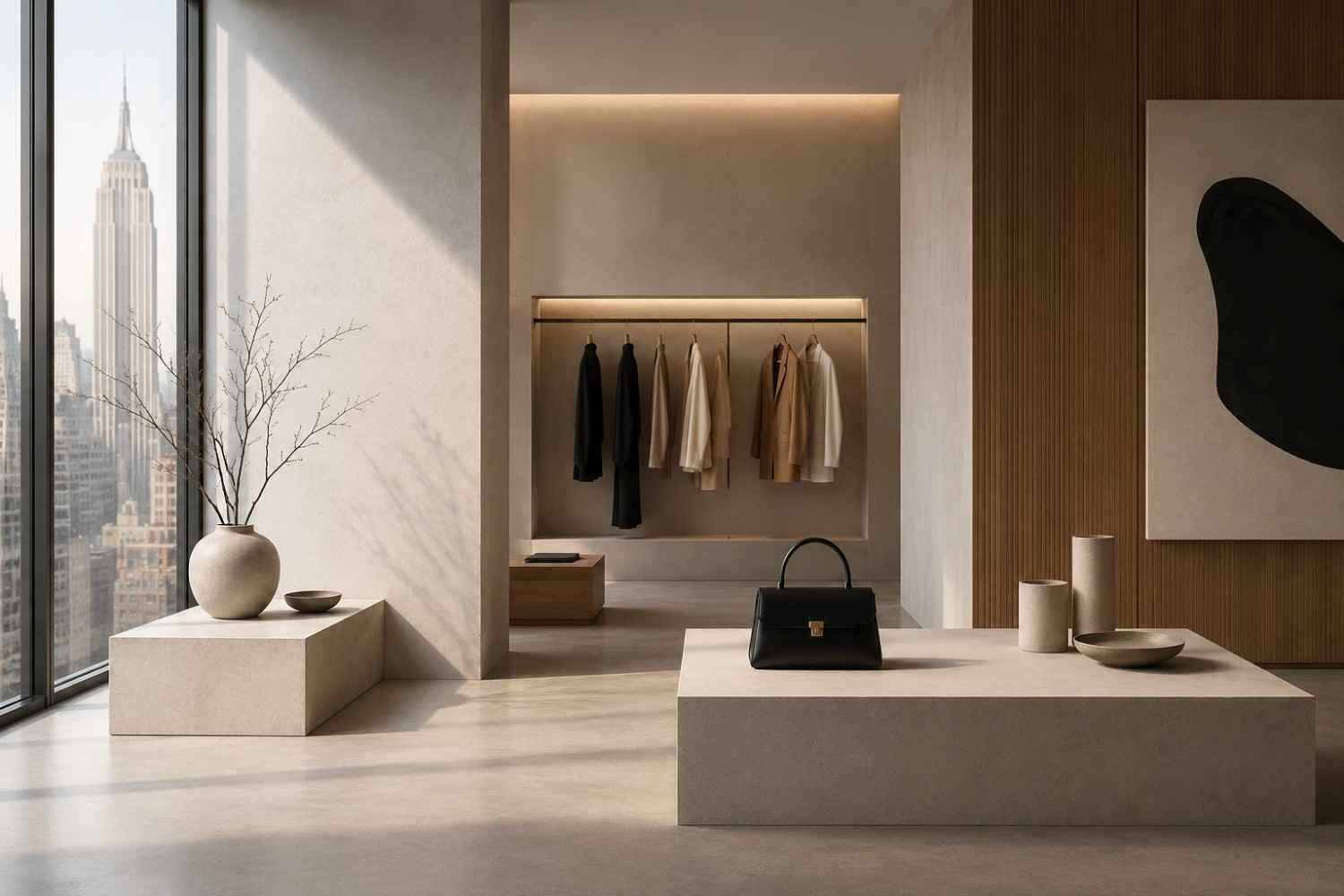
Layout and Spacing Often Decide Whether Branding Feels Premium
People do not always consciously notice spacing, but they absolutely react to it.
Cheap-looking branding usually feels cramped. Premium branding creates room for elements to breathe.
The Role of Negative Space in Premium Branding
Negative space helps frame content in a more intentional way. Empty space can make typography, products, and imagery feel more important.
Luxury brands often leave large portions of layouts untouched because the emptiness itself creates focus. That visual pacing gives the impression of confidence instead of desperation for attention.
Strict Alignment Creates Trust
Clean layouts matter because they signal precision. Premium website design often follows invisible grid systems that keep every element aligned consistently.
When buttons, text blocks, and visuals feel slightly off-balance, people subconsciously perceive the brand as less trustworthy.
Asymmetry Can Feel More Editorial
Centered layouts are safe, but slightly asymmetrical compositions often feel more modern and elevated. Editorial-inspired layouts create movement while still maintaining balance.
That subtle unpredictability can make a brand identity feel more custom and less template-driven.
FAQs: How To Make Branding Look Expensive Through Better Design Choices
1. How can I make my branding look more luxurious?
Focus on cleaner layouts, better typography, muted colors, strong spacing, and visual consistency. Luxury branding usually feels restrained rather than overloaded.
2. Do minimalist brands look more expensive?
In many cases, yes. Minimalist branding removes distractions and creates a more refined customer experience, which often increases perceived value.
3. What colors make branding look premium?
Deep neutrals, earth tones, charcoal, cream, navy, olive, and monochromatic palettes often create a more sophisticated visual identity than highly saturated colors.
4. Why does typography matter in premium branding?
Typography shapes how people emotionally perceive a brand. Elegant serif fonts, balanced spacing, and strong hierarchy can instantly improve brand trust and professionalism.
Wrapping Notes
The brands that feel expensive are rarely the loudest ones. They feel controlled, refined, and intentional because every design decision supports a larger visual identity. From typography and spacing to photography and layout structure, premium branding depends on restraint far more than excess.
Most businesses do not need massive budgets to improve their branding. They need sharper editing, stronger consistency, and a better understanding of how people emotionally respond to design choices. Small visual changes can completely shift how a brand is perceived.


